DashSphere — High-Density Financial Telemetry & Analytics Dashboard
Enterprise executive dashboard engineered with Recharts telemetry, customizable multi-metric widgets, Lenis smooth scrolling, and zero-layout-shift data visualization.
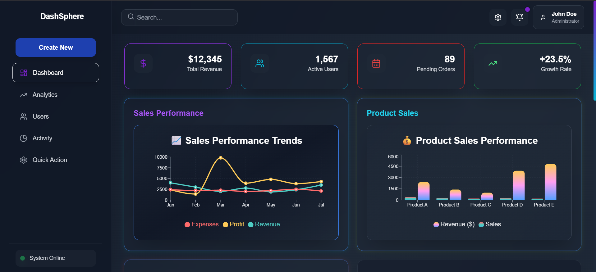
DashSphere — Interface & System Overview
System Capabilities & Field Deployment Architecture
Live operational specifications, core architectural subsystems, and functional highlights verified across production environments.
It is fully responsive frontend dashboard which helps you manage your products types shares sales multiple charts help you view your revenue profits sales everyting clearly . Theres a proper charts for sales , multiple product sales and also the market overview for your products . It is a customizable build we can build any charts and customise according to our needs. AS of now it is using Dummy data
Engineered Subsystem 01
Optimized Recharts components render complex time-series telemetry with minimal DOM overhead.
Engineered Subsystem 02
Framer Motion layout tags provide fluid widget reorganization without jarring page reloads.
Engineered Subsystem 03
Responsive breakpoint grid ensures optimal data density across 4K monitors and laptops.
Operational Constraint Resolved 01
Unoptimized SVG chart libraries choke browser CPU threads during active window resizing.
Operational Constraint Resolved 02
Uncoordinated asynchronous data fetches produce severe layout shifts across widgets.
Operational Constraint Resolved 03
Rigid dashboard layouts prevent executives from prioritizing the KPIs that matter most.
Telemetry Overload, DOM Bloat & Sluggish Chart Rerenders
Modern enterprise executives monitor dozens of concurrent operational streams—revenue velocities, inventory turnarounds, user cohort drop-offs—which traditional dashboards render as sluggish, uncoordinated widgets.
Embedding numerous heavy chart instances regularly causes browser frame drops, cumulative layout shifts (CLS), and uncoordinated state cascades that make live data interpretation frustratingly slow.
Unoptimized SVG chart libraries choke browser CPU threads during active window resizing.
Uncoordinated asynchronous data fetches produce severe layout shifts across widgets.
Rigid dashboard layouts prevent executives from prioritizing the KPIs that matter most.
Modular Recharts Architecture with Framer Motion Layout Transitions
Architected a high-density, responsive dashboard in React and Tailwind CSS utilizing optimized Recharts components with SVG canvas decoupling for 60fps telemetry rendering.
Coupled with Framer Motion layout animations and Lenis smooth scrolling, the platform allows executives to toggle metric scopes, filter revenue channels, and inspect multi-year financial trends with zero layout jitter.
Optimized Recharts components render complex time-series telemetry with minimal DOM overhead.
Framer Motion layout tags provide fluid widget reorganization without jarring page reloads.
Responsive breakpoint grid ensures optimal data density across 4K monitors and laptops.
Structural Bill of Materials & Pipeline Flow
Execution Pipeline Sequence[ 01 → 05 ]
Production Benchmarks & Empirical Lab Test Plates
Smooth chart animations and widget transitions
Memoized data filtering response time
Zero cumulative layout shift (CLS: 0.00)
Interactive telemetry visualizations supported